Most portfolio websites are forgettable. You land on a hero section with a gradient, scroll through a grid of project cards, read a bio that says the person is passionate about their craft, and close the tab. The information was delivered. Nothing was felt.
DavidStemper.com does something different. It refuses to let you pass through it as a passive reader. Instead, it asks you to arrive, to notice, and to recognize that each page is a door into a different fictional universe. The site is not a portfolio. It is six interconnected worlds, each one themed to a beloved corner of pop culture, and each one designed to make you smile before you even read a word of copy.
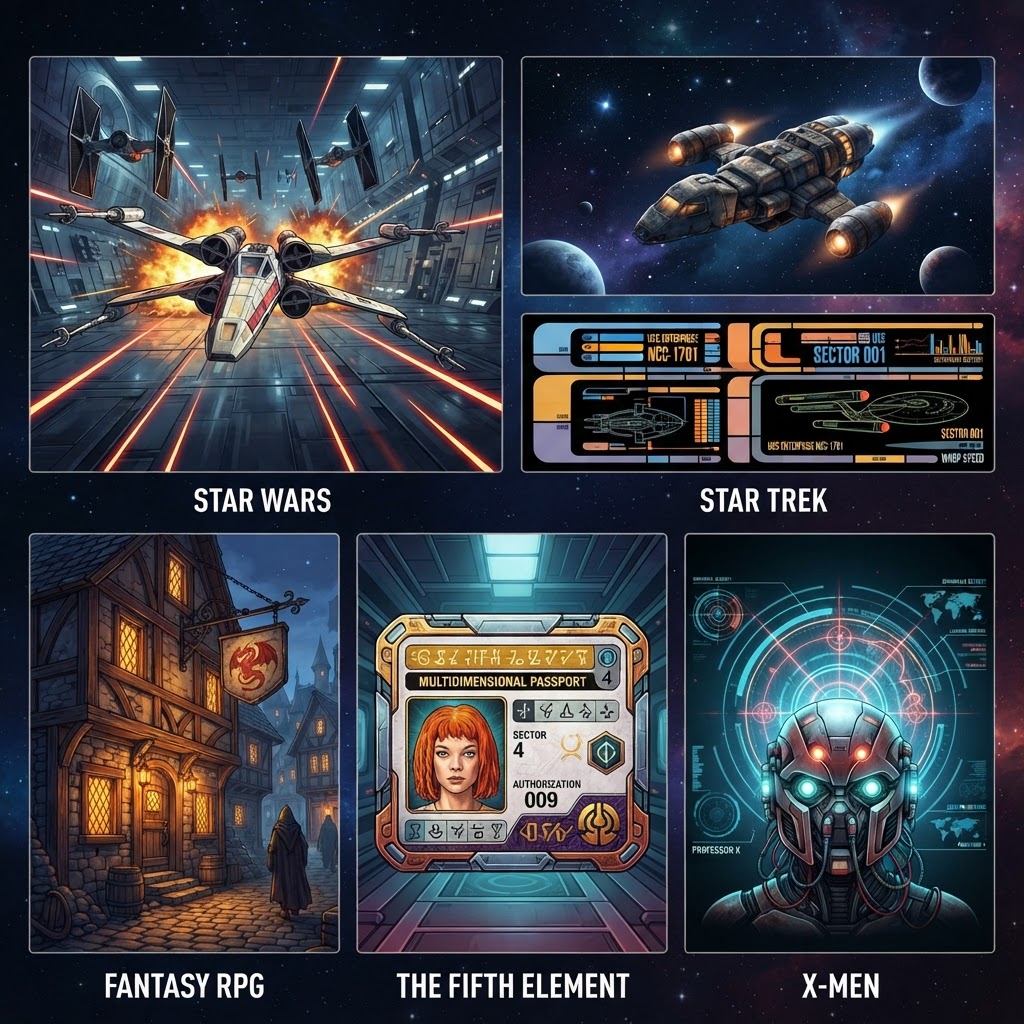
The Homepage: A Galaxy Before the Franchise
Before you encounter any specific franchise, the homepage sets the cosmological stage. A pure black background. A particle simulation of a spiral galaxy rotating around a black hole at its center. Warm gold near the singularity, bright white in the mid-regions, deep blue at the outer arms. The animation is not a Star Wars reference. It is not a Star Trek reference. It is something older and more primal: the galaxy itself, the thing that all six franchises orbit in one way or another.
The navigation bar floats at the top in thin, light-gray sans-serif text. WORK. WRITING. SOFTWARE. WEBSITES. ABOUT. CONTACT. Six pages. Six portals. Each one, as you are about to discover, opens into a fully realized world with its own typography, color palette, language, and logic.
WORK: The Imperial Archive
Click WORK and the screen transforms into the Imperial Archive, Sector 76. The crawl begins: A long time ago, in a galaxy far, far away. The header reads EPISODE IV, A NEW FRAME, a photography pun that lands perfectly for anyone who has ever waited for a long exposure to finish. The opening paragraph is a Rebel photon dispatch, describing photons streaking across darkness from hidden dark-sky bases across the galaxy.
The photography portfolio sits beneath this framing, filtered by categories labeled as archive records. ASTROPHOTOGRAPHY. TRAVEL. LANDSCAPE. PORTRAIT. STREET. A status line at the bottom counts the records: 34 records located in the Jedi Archives. The color scheme is Star Wars to its bones: bright yellow on black with cyan accents, the visual language of Imperial computer displays and Jedi temple inscriptions.
What makes this more than decoration is the consistency. The theme does not fade after the hero section. Every filter button, every card, every status indicator maintains the Imperial Archive aesthetic. You are not looking at a Star Wars skin applied to a portfolio. You are inside a Star Wars portfolio.
WRITING: Serenity Valley Press
The WRITING page abandons the dark space aesthetic entirely and drops you into a newspaper. But not just any newspaper. This is the Serenity Valley Press, an Alliance-approved media publication from the Firefly universe, complete with Chinese characters running alongside the English masthead, a barcode, and a publication date in the Firefly calendar: 2517.08.23.
The tagline is the line every Browncoat knows by heart: You can not take the sky from me. The sections are bilingual: TECHNOLOGY and its Chinese equivalent, TRAVEL and its translation, GEAR in both languages. The volume number, edition, and price (2 platinum) are all details that could only come from someone who lived inside the Firefly universe and loved it enough to get the small things right.
The newspaper layout itself is genuinely functional. Articles are presented as dispatches from the black, with reference numbers, read times, and section labels. The grayscale photography and serif typography make it feel like a real broadsheet that happens to be reporting from a fictional solar system. The design serves the content. The theme serves the design. Neither is decoration.
SOFTWARE: LCARS 44-1701
The SOFTWARE page is a fully realized LCARS interface. For anyone who has ever watched Star Trek: The Next Generation and wanted to touch a control panel on the Enterprise, this page is wish fulfillment. The color-coded horizontal blocks along the left side, the orange titles, the light-blue active states, the rounded rectangular buttons with Engage labels, the stardate notation in the header. It is all there.
The software projects are listed as modules in the Stemper Fleet Yards registry. Each one has a status indicator (OPERATIONAL), a module number, and a description written in the clipped, technical voice of a Starfleet systems readout. KIYI, the personal shopping platform. REALMS, FORCE ID, STOREWISE, SCREENREC. Each gets its own LCARS panel with color-coded categorization.
The Engage buttons link to the live projects. The END REG button at the bottom closes the registry. Every interactive element has been reimagined through the LCARS lens, which means the page is not just themed. It is a functioning interface that happens to speak Star Trek as its native language.
WEBSITES: The Quest Board
The WEBSITES page takes the sharpest aesthetic turn. Where the other pages are sci-fi, this one is pure fantasy. A painted background depicts a medieval village at night, with a castle on a hill and a tavern in the foreground bearing a sign that reads THE DRUNKEN DRAGON. The header announces THE QUEST BOARD, posted by order of the Guildmaster, and the invitation is addressed to adventurers of the web.
Each website project is presented as a completed quest on a parchment scroll, with a quest type label (ARCANE QUEST), an XP reward, and a description written in the second person, as if you are reading a bounty notice on a tavern wall. The signal project, a cyberpunk bar experience, sits inside this medieval framing like a magic item in a treasure chest, the contrast between the fantasy container and the cyberpunk content making both feel more vivid.
This is the page that reveals the depth of the concept. It would have been easy to make every page a sci-fi interface. Instead, the WEBSITES page reaches into a completely different genre, proving that the theming is not a single gimmick repeated six times. It is a creative principle applied six ways.
ABOUT: Multipass Verified
The ABOUT page is The Fifth Element. The header reads SUBJECT DOSSIER, and the status bar confirms PERFECT, MULTIPASS VERIFIED. The color scheme shifts from black to a gradient of rusted orange and deep navy, the palette of the 1997 Luc Besson film that built an entire future city from European comic book aesthetics and airline design.
The biography itself is straightforward. David Stemper describes himself as a photographer obsessed with threshold moments: the last light over a mountain ridge, the first stars at dusk, the way a foreign city feels at 3 a.m. He works in astrophotography, travel photography, and the quiet documentation of light that most people walk past.
The Fifth Element framing works because the film is fundamentally about an ordinary person who turns out to be extraordinary, which is the subtext of every creative portfolio bio ever written. The multipass is not a joke. It is a statement about identity, verification, and the right to move freely across borders, which is exactly what a travel photographer does for a living.
CONTACT: Cerebro Uplink
The CONTACT page closes the journey with the X-Men. The header reads CEREBRO UPLINK, SIGNAL DETECTED, and the address is the Xavier Institute for Higher Learning at 1407 Graymalkin Lane, Salem Center, NY. The contact form is a secure transmission channel. Your name is your codename. Your email is your comm address. Your subject is your mission subject. The submit button says TRANSMIT MESSAGE.
The subtle blue grid overlay and the faint silhouette of Cerebro's spherical chamber behind the content give the page the feeling of a secret communications terminal, which is what a contact form on a portfolio site actually is. You are sending a message into an unknown location, hoping the right person receives it. The X-Men theme turns that mundane interaction into something with stakes.
Why It Works
The temptation with themed design is to stop at surface-level references. A Star Wars font here, a Star Trek color there, a Firefly quote in the footer. DavidStemper.com does not do that. Each page is a complete aesthetic system with its own typography, color palette, layout structure, copy voice, and interaction design. The WORK page uses a progress bar styled as a Rebel data transfer. The SOFTWARE page uses LCARS elbow panels as navigation. The WRITING page formats articles as newspaper dispatches with bilingual section headers. The WEBSITES page uses parchment scrolls with XP rewards. The ABOUT page uses a multipass verification system. The CONTACT page uses a Cerebro transmission protocol.
None of these are skins. They are architectural decisions that affect how the content is organized, how it is read, and how it feels to interact with. The theme is not applied to the design. The design emerges from the theme.
The site also does something that most themed portfolios are afraid to do: it commits. There is no halfway point. The WRITING page does not occasionally break from the Firefly newspaper format to show a normal blog layout. The SOFTWARE page does not abandon LCARS for a standard project grid after the hero section. Each world is sustained for the entire duration of your visit to that page. If you do not recognize the reference, the page still functions as a well-designed portfolio. If you do recognize it, the page rewards you with a depth of detail that says: someone who loves this built this.
The Throughline
Six franchises. Six genres. Six design languages. But there is a thread connecting all of them, and it is the same thread that connects the homepage galaxy to the contact form's Cerebro terminal. Every franchise on this site is about ordinary people in extraordinary worlds. Luke Skywalker was a farm boy. The Serenity crew was a small band of outcasts. The Starfleet crew explored the unknown. The fantasy adventurer starts in a tavern. Korben Dallas was a cab driver. The X-Men were outsiders who learned to use what made them different.
DavidStemper.com is a photographer's portfolio, but it is also a statement about what it means to build something with your own hands and your own references, without asking permission or compromising the vision. The site does not apologize for being nerdy. It does not hedge its references in case someone does not get them. It presents six fully realized worlds and trusts you to either recognize them or simply enjoy the design.
That trust is the rarest thing in web design. And it is why this portfolio does what most portfolios fail to do: it makes you want to explore every page, not because you need the information, but because you want to see what world comes next.